Overview
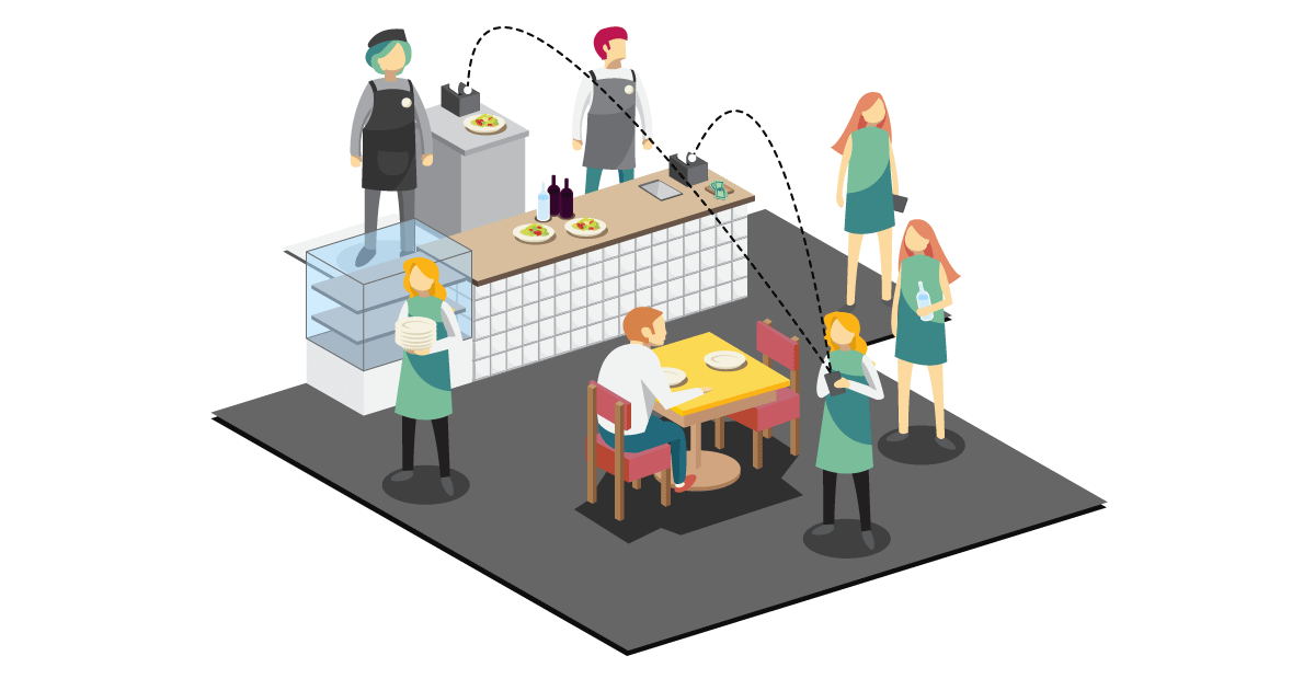
Using a design thinking approach, we enhanced the POS system at Bluff Kup Cafe & Thai Kitchen in Melbourne. A survey of customers and staff revealed issues with menu knowledge and usability of the current system. To address these, we proposed a mobile-based solution. We tested its usability with a paper prototype and then a digital one in Pixate Studio.
Tool

Business Goal & Opportunity
The recent upgrade to our mobile point of sale (POS) system offers faster payment processing and enables customers to discover and review restaurants on their mobile devices. Despite using a POS app for over two years, Bluff Kup Cafe and Thai Kitchen face issues with certain features slowing down the app, disrupting restaurant operations during busy periods.
This project employs a design thinking approach, covering Empathize, Define, Ideate, Prototype, and Test stages, to evaluate the current POS app. The goal is to provide recommendations for creating a more efficient app tailored for restaurants in Melbourne.
About Bluff Kup Cafe & Thai Kitchen
Bluff Kup Cafe & Thai Kitchen is a charming 50-seat Thai restaurant in Black Rock, Australia. They aim to provide delicious Thai food at reasonable prices with quick and friendly service.
This restaurant was chosen for the project because their current POS application isn't well-suited for their needs. Most of their waitresses are local teenagers familiar with Thai cuisine, and they hope the new POS app will help staff upsell menu items and make recommendations to customers effectively.

Design Thinking
Empathise
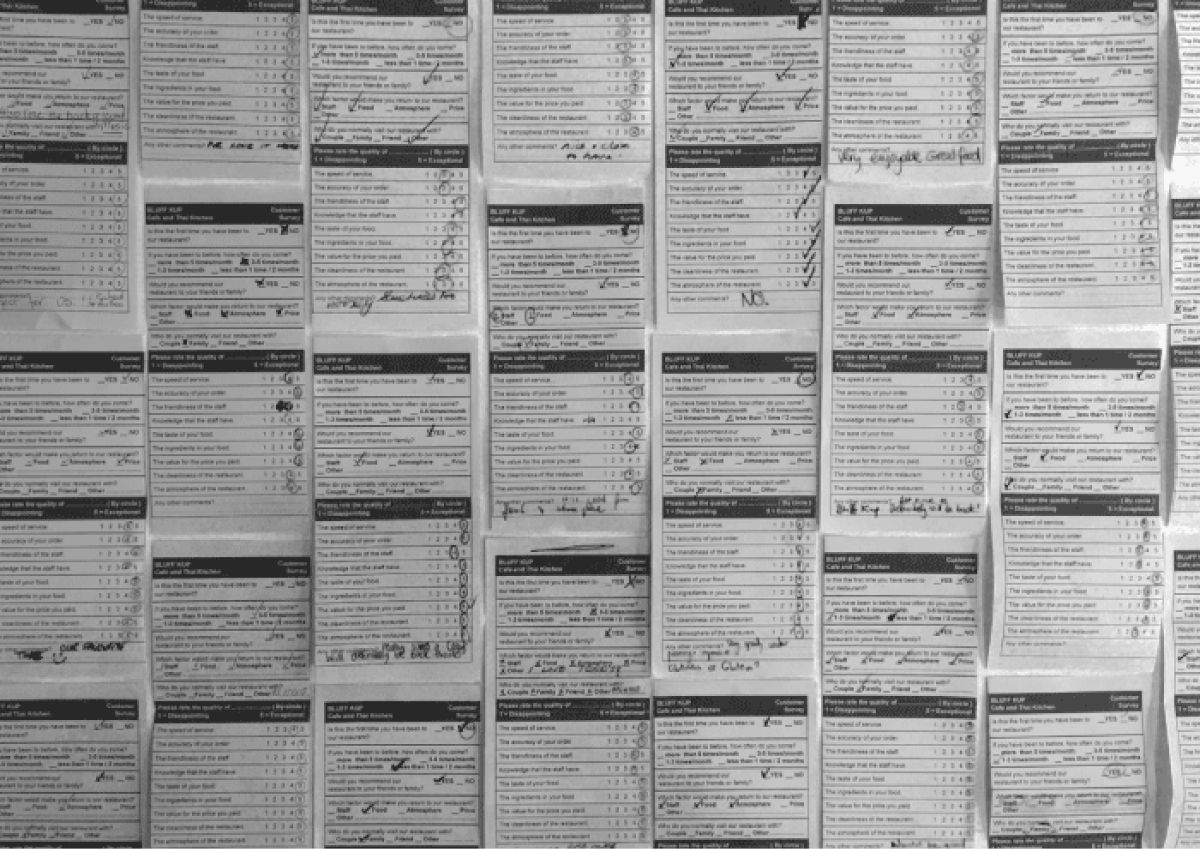
The manager's initial concern was that many waitresses, not well-versed in Thai cuisine, found the menus confusing, and the current POS app didn't help. Surveys of both customers and staff were conducted to gather insights for improving the existing POS app or creating a new one.

Observations reveal that the primary issue with the current POS app is the slow order-taking process. The app seems to have an excess of features that aren't commonly used in Melbourne, and some functions are difficult for staff to access, leading to recognition challenges.
It's worth noting that the restaurant's customer base primarily consists of locals who return due to the food quality and the friendly staff.

Define
Survey results reveal staff's limited menu knowledge and the need for faster service. The current POS app primarily acts as a mobile cash register but lacks features to assist staff in upselling or provide extensive menu information. The ideation process aims to improve the app to enhance upselling capabilities and streamline customer order-taking.
Ideate
During the ideation phase, the team was presented with the survey results, and they were encouraged to propose any ideas, whether feasible or not. Five potential concepts were considered: restaurant featured PTV, healthy POS, gaming POS, attractive POS, and artificial intelligence POS. With the growing interest in digital devices in 2016, the emergence of Chatbots led to the selection of artificial intelligence POS as the final idea for enhancing a new POS application.

Prototype
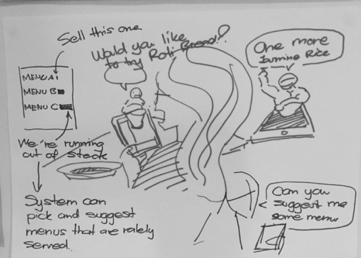
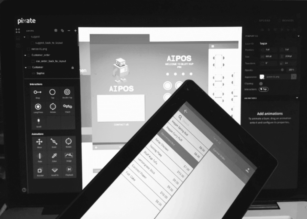
To prototype the POS app, we initially used paper prototypes for quick evaluation by actual waitresses. This helped identify issues for a busy restaurant environment. We then created a second prototype using Pixate Studio, designed for Android tablets, which are more cost-effective than Apple tablets. Both prototypes concentrated on key features like table layout, wireless ordering, payment processing, customer management, and upselling.

Test
We undertook the usability test to indicate some feedbacks about the prototype to seek improvements for the next prototype. The initial prototype is paper-made because it is easy and quick to make, and four restaurant waitresses were allowed to test the prototype. Every participant was provided with the paper-made prototype and was asked to do six different tasks, which mainly focused on the critical features of the new POS application on the prototype. After a participant was doing each task, the observer made notes about responses and interactions with the prototype. After that, the participant was asked additional questions to evaluate the prototype. The results can indicate problems of the prototype and, in turn, can be used to improve the next prototype.

The second prototype was crafted using Pixate Studio, a user-friendly software for building interactive prototypes that can run on various mobile devices. The outcomes of prototype testing, along with additional guidelines, served as valuable inputs for enhancing the second prototype.
You can download the full report here

